8th Light's Apprenticeship Page
January 27, 2016Just recently I made my first major contribution to the 8th Light website. On Monday we pushed the new 8th Light apprenticeship page live. I was excited to have the opportunity to create something of my own for our company’s website.
After doing some user interviews and thinking about the flow of the page it became apparent that this project was not going to be without it’s challenges.
Don’t overwhelm your readers
As part of the redesign we knew we wanted to add more information about the apprenticeship program, but also keep our user’s engaged and not intimidated by the sheer amount of information.
Laying out the information in paragraphs was one of the first things I thought about. I thought that having the information upfront may be a good idea.

After the actual wireframe our team quickly realized that this type of layout was not optimal. There was simply too much information. I went back to the drawing board and created a different type of layout. We found this to be much more user-friendly.

Breaking up the text in to alternating sections and adding photos really made the content much easier to read. We were presenting the same amount of information and the page length was slightly longer, but we felt this was the best option.
Wireframe iterations
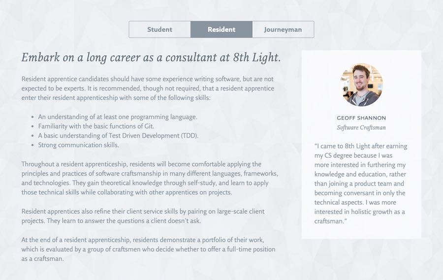
Perhaps the biggest was expanding on each of the apprenticeship levels. We also wanted to include some insight from current 8th Light employees in the form of a quote or testimonial that directly corresponded to each level.
The biggest challenge was actually deciding how to utilize the space of the page effectively. Do we create a section for each apprenticeship level that is always shown? We could do that, but then the length of the page grows tremendously. If we opt to go with sections that are always visible, should we alternate them like we did the introductory paragraphs? The layout and some of the use cases proved that this may not be the best option.
Keeping page length and readability in mind I iterated on the design and ultimately created a wireframe that looked like this:

I imagined one section that would contain the content for all three of the apprenticeship levels. At the top of the section would be small navigation with a button for each level. Depending on which button was selected would determine which section was shown. I thought this particular design would keep our page length in check while also keeping the content easy to read for our users.
Much like our wireframe, I think the final design came out really well.
The conclusion
Overall the project was a lot of fun. I really enjoyed finding solutions to the challenges we faced. I felt like it was a great learning experience and I am happy to have left my mark on the 8th Light webpage.
Make sure you visit the redesigned apprenticeship page and tell me what you think!