Holiday
September 1, 2015Over the last few days I have been working on a new project called Holiday. Holiday is another travel website project. Why create another travel website you ask? Well, just the week before I applied to become a resident apprentice at 8th Light, and not long after sending off my application I received an email from a designer at the company.
I was excited to receive an email back so quickly. The designer’s name at 8th Light is Chris Peak. In the email Chris said that he wanted to give me a project, not only to see my skills, but to monitor my progress. He stressed that the project was not a test, but a chance for him to get a sense of my process and see how I work. The assigned project was to create a travel website. Having just did this, I felt the pressure was really on to not only make it better than Zzyzzx, my first travel project, but to make it great.
Iterate and improve
Even though I felt great about Zzyzzx I wanted to make this next project even better. Going into the project I knew I wanted to add some complexity to the user inputs. Zzyzzx used a single user input which looked great, but did not allow users to enter in a whole lot of information. I knew if a potential user was going to plan something like a vacation that I should expand on the overall form group.
There were still a lot of things from Zzyzzx that I really liked. At this point I started to look at my past project as a first iteration and continue to develop and refine my new project.
Making progress
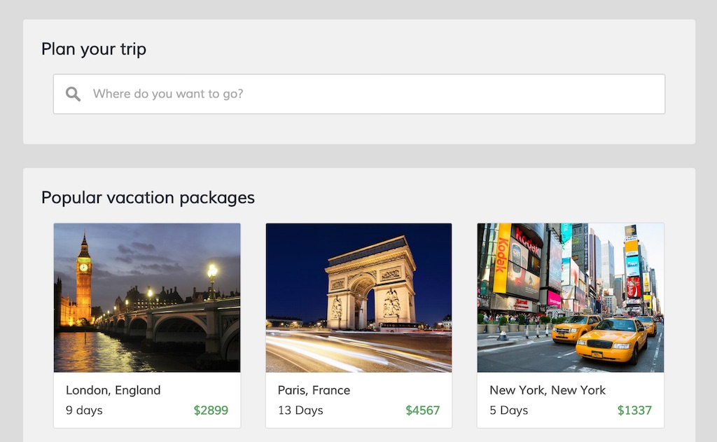
Early on I made the decision to use a very similar layout to Zzyzzx. I wanted a nice, dark header that stretched the width of the screen. I also wanted to keep an area on the page that displayed pictures of popular or featured destinations. While browsing for photos I found an amazing picture that I could use for the website’s hero. I ended up gathering most of my color palette from the image as well.
After the first few days of working on Holiday I had a pretty good sense of where I was going with the project.
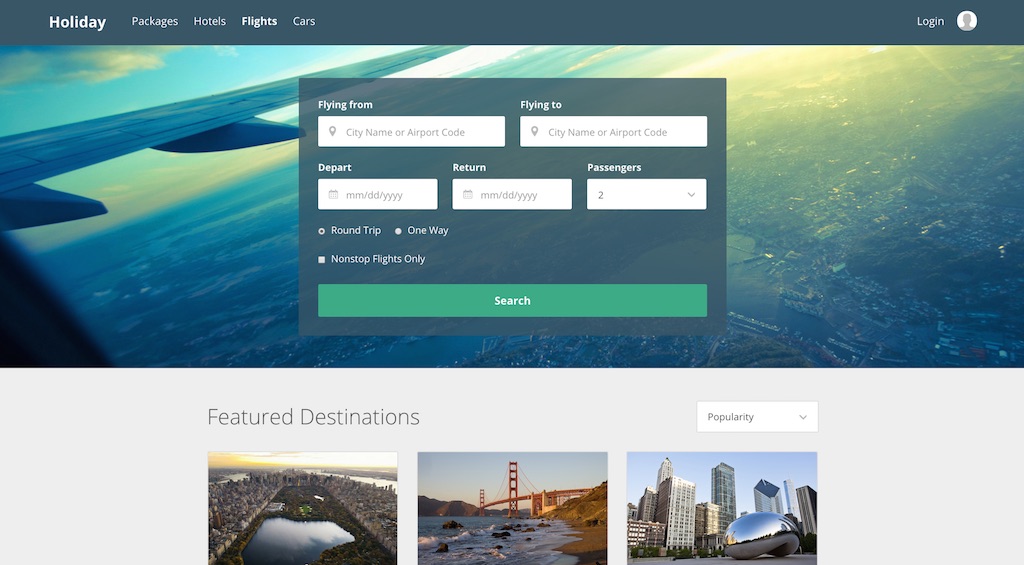
With the majority of the design in place, I began to tweak some of the project’s main features. I was not sold on the flight selection table and I knew something had to change. I felt radio buttons were not ideal, and their location within the form was not optimal.
After trying a few options, I thought that using tabs at the top of the form group worked the best.
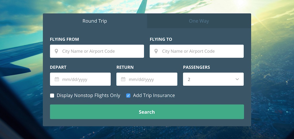
I think removing the radio buttons was the right way to go. Not only do the tabs look better, but I feel they are much easier to use, especially on a mobile device.
Feedback
The next day I showed Chris where I was with the project. Chris provided some great feedback about psychology in design, and how it can be used to influence users, increase sales and further generate profit. The resources were really helpful and great reads. If you are interested, I strongly recommend taking a look at both Psychology for Designers and Dark Patterns.
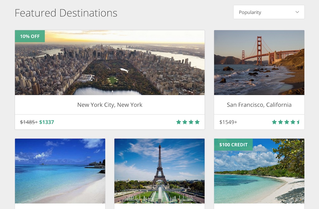
Since the project was a single page, I felt somewhat limited in the elements I could add. I ended up adding a user rating and special labels to the cards. I thought the labels were great because they highlighted discounts and special incentives from Holiday. I also decided to be a little devious, and add a pre-selected travel insurance option when users search for their flights.
Overall I am very happy with how the project turned out. If you’d like, you can visit the live project at noahrogers.com/holiday.
What do you think? If you have any feedback I would be glad to hear it! You can reach out to me on Twitter.